Why you need a responsive website
It's 2013, technology is moving so fast chances are that if you purchase the latest mobile or tablet, it's outdated by the time you get home. That's why your website needs to be future proof. It needs to respond to any screensize in order for it to be legible and user friendly. It needs to be a 'responsive website'.
A responsive website is a website that adapts to the screen it is being viewed on. That means the content and features on the site are manipulated to be user friendly to whoever is browsing the site on whatever device (mobile, tablet or laptop for example).
A website that is not responsive or doesn't have a mobile specific website will just be scaled down by the device it's being viewed on. Everything appears zoomed out, and to navigate, read any text and generally use the site you have to constantly zoom in and out of certain areas. This is in contrast to a responsive website, where you can use the site much easier without having to zoom in, out and around!
 The homepage of this website as viewed on different devices
There are so many devices out there, the variations in screensize, weight, look and feel are almost infinite; or at least the possibilites are endless. That is why websites can no longer be designed and built for one specific device.
If you have a website that is built for someone using a laptop or desktop computer, you are potentially alienating a huge portion of potential visitors to your site. This isn't to say a website built for a large screen won't work on a smaller device, but it probably won't be user friendly, fast, easy to navigate or read.
All bases need to be covered when your website is designed, who knows what the next popular smartphone will be? In this age of technological advancement you cannot design a website for a specific device, you have to design for all devices; past, present and future.
"51% of the UK have access to a smartphone" - Google Services
This is a massive slice of the market, if your site isn't accessable for these people are they really going to go to the trouble of looking at your site on a larger screen? Or are they going to look elsewhere? It really is an unneccessary risk to have a website that isn't built for a rapidly expanding market.
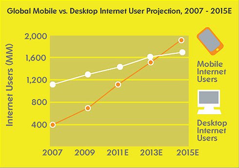
"By 2014, mobile internet should take over desktop internet usage" - Microsoft
This means your website should not only be built with mobile users in mind, but it should be built primarily for them. If more people are going to be visiting your site from a non-static device it makes sense that your website should think of them first, after all it could well be the largest share of your target market.
 Image Source: Microsoft Community
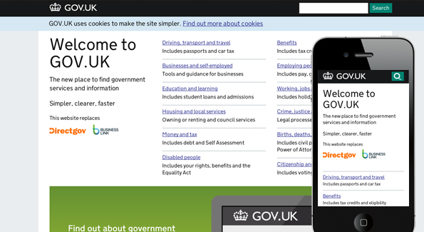
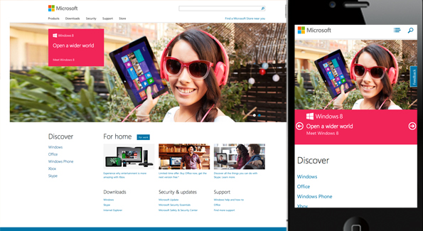
Major companies and corporations are getting on board with responsive websites. Establishments like Starbucks, Currys, Microsoft and The British Government have all recognised that their website's need to cater for all users. You can see below how the British Government and Microsoft websites have adapted to the screensize they are being viewed on.


It's clear that leading organisations who spend millions on research, are steering towards having responsive websites that are optimised for mobiles, tablets, laptop, desktop and whatever other device may be out there in the future. So if your website isn't responsive, your going to be left behind.